I finished that bit on Le Corbusier, the godfather of Modernist architecture. When I said the bit would be more serious and more absurd than last week’s post, I was half-right.

Sure, some nuggets of truth are hidden among the 6m 40s of A Story Is A Machine For Living In, but there are plenty of nuggets of sweet absurdity to keep folks engaged.
This got me to thinking about how, sometimes, the medium is the message.
[Talking about absurdity, check out the Apoplexy Tiny Letter]
You see, A Story Is A Machine For Living In is a piece in PechaKucha format. PechaKucha (anglicisation of the Japanese, meaning chit-chat, and pronounced Pe-CHAK-ucha) is a form of presentation that was designed in Japan for use by architects. The idea is, the presenter has 20 slides, and 20 seconds for each slide, to get their point across.

While I was in the initial stages of conceiving the piece, I was chatting to an architect about the idea. He told me that people were doing some PechaKucha presentations at his firm, and the first thing they did was changes the rules so everyone could be a bit more prolix.
Makes sense. A literary translator recently told me that
Architects think they’re great writers, but architectural writing is terrible – it’s obfuscatory.

And I’m the one who just used the word prolix, so…
But I found that sticking to the rules of Pecha Kucha was a great way to work when making a presentation. Points have to be made succinctly. Coming up with images indicates interesting directions. And the humorous possibilities of juxtaposing incongruous text and images are a bit of a godsend, if that’s the sort of direction you’re going in.

So, the medium did become the message, in this case. After a fashion.
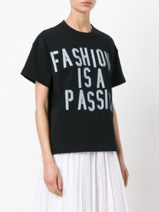
Speaking of fashion, the first short story I ever had published was written to fit the theme Sartorial, and I’ve always been interested in how we use clothing to convey messages, whether it’s the subversion of Vetements or the aggressive de-intellectualisation of Milton Glaser.

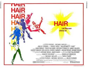
Film, of course, is another way to communicate ideas. And beyond film, the posters accompanying them. What’s the image you see in your mind when you think of Jaws, for example? Or A Clockwork Orange?

OK, I should have added, if you’re not a Glaswegian. But you get the idea. The movie Jaws is famous for discouraging people from going swimming. Even in indoor pools. One explanation is that Steven Spielberg was so disappointed in his animatronic shark, that he had to keep sight of it to a minimum using particularly suspenseful direction.
Another explanation could be that the image used in the poster for the movie – and indeed, for the cover of the paperback – was so striking, so primal.

These thoughts come to mind because legendary film poster designer Bill Gold passed away a couple of days ago. He didn’t do the poster for Jaws, but he did do A Clockwork Orange. And Casablanca and Barbarella and The Exorcist and All The President’s Men and The Jazz Singer and In The Line Of Fire and J. Edgar and thousands of others. In fact, Jaws is the only movie poster ever released that wasn’t designed by Bill Gold.*
The amazing things about all these posters aren’t limited to them being so memorable. There’s also the fact that so many of them convey a sense of their time so vividly. I’ve included some movies in the list above not because they’re necessarily great films, but because they’re from different decades. Gold designed posters for major films in every decade from he 1940s to the 2010s.

And that the sense of the movies and the times is delivered with such conciseness and ease and brevity. Not unlike a good PechaKucha presentation.
See you next week!


